Welcome

Welcome to my blog. Here you will find research and planning construction evidence, and evaluation for my AS foundation portfolio.

Tuesday, 28 February 2012

Creating Logos (1)

 Firstly I created this image by outlining the shape of a picture of a person, then I filled it in a specific colour, then created another shape which I tucked behind the front outline to create the image of someone behind some ( a play on words of the companies name).


I then proceeded by placing this image upon a black background in order to make the transition from my sequence to the titles more effective and smooth.
I then used the side 'Dafont.com' to select a font that I thought was appropriate for the title and the image I was trying to go for, I chose a font called 'Stickons Too' and placed it at the bottom of my logo, overlapping some of the bottom logo to create an effect as if the logo and text are combined together making one image.


I then went onto use to 'Stroke' effect on the text creating a black border around the text which gave the text the false look of being connected to the logo thus completing this logo.

Friday, 24 February 2012

Soundtrack

 I used a program called Garage band to create my soundtrack.

I started of with a single loop sound which creates an pleasant atmosphere surrounding the opening, giving a sense of 'journey' which we watch the protagonist go through, being followed close behind by the spirit.
 I then blended the same loop track in with my initial track in order to make it longer, I also scoped into delete the sound I didn't want in order to make the sound play smoothly without it sounding out of place.
 I then went onto adding 'Kicks' during heavy beats of the track in order to enhance the sound, however, I have done so in order to make it sound subtle, so the audience wont realise that there are two different sounds playing at once.
I finished of the soundtrack with a 'viynl scratch' which will play as the opening ends, typically this sound is associated with when a track has finished, therefor, I felt it was appropriate to add it to my own track, as it created a new sound for the audience to hear, as well as instill the idea of the opening being over, moving onto the main part of the film.

Logo Alterations

 Ive made various alterations to each logo. With each logo I have changed the background colour to black as I believe coming out of black to my opening scene will have a greater reaction from my audience then it would have coming from a white background.

I altered the text of 'Behind Yu' to give it more of a broad presence in the shot as before I felt to was to slim, this way the title of the company is broad and visible.
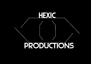
 I changed the name of this company as well as the font. The name I changed from 'Hex' to 'Hexic' as I believed it sounded more professional then just 'Hex', the font was changed to have the same broad effect as the font above, I also saw the font had more shape to it making it easier to read by the audience.
This is a completely new logo I created after having trouble importing the 'Cubicraft' logo into Final cut, therefor I thought I'd create a new one altogether. I attempted to be more createful with this design by warping the text around the logo of a knocked out face, which I believe has an interesting effect and almost makes it look like more of a badge/label than a logo, which I like.

Tuesday, 21 February 2012

Created Logos

I decided to do a few alterations with this logo, adding the lines onto the main figure outline to ensure the audience understood that the head behind the figure was another person all together, as the image is supposed to mimic the companies title (behind you)
For this logo I didn't chance anything, except for the text of the logo as I believed this font was appropriate to the company name/logo as the basis of the logo was shapes, and this font was for cube-like, therefor I believed it fit with the logo


This was a new design which I created during remaking the other two logo's in Photoshop, the design is simple, and the title of the company is in a pixel type font which matches the simple design of the logo

Monday, 20 February 2012

Progress Update

There are 6 weeks until the Easter break which means - 6 weeks of lesson time to complete my foundation portfolio.

There are 60 marks available for construction and 20 marks for Research and Planning and 20 marks for evaluation - 100 marks in total

To achieve a grade:

A I need to get 80 marks

B I need to get 70 marks

C I need to get 60 marks


To be in level 4 (grade A/B) my work must demonstrate excellence throughout.

By Monday 5th March I should have a rough cut of my products

By Monday 19th March my products should be completed

From Monday 19th - Friday 30th March I will be working on my 7 evaluation questions.

The my completed portfolio should be submitted for formal marking on Monday 16th April. I should use the Easter break to make any minor amendments to my work.

What I need to do;
  • I'll have to utilize my time in order to get all my footage
  • Have an idea of how I will edit my footage once I acquire it
  • Ensure my schedules fit in with the actors time slots
  • I'll check the level 4 criteria throughout to ensure I get a good grade

Friday, 10 February 2012

Research Into Logos

Recce

This recce gives both a clear insight as to what the location that ill be shooting at as well as a description and some additional comments I've made myself about why this location is desirable and what I intend to do whilst there.